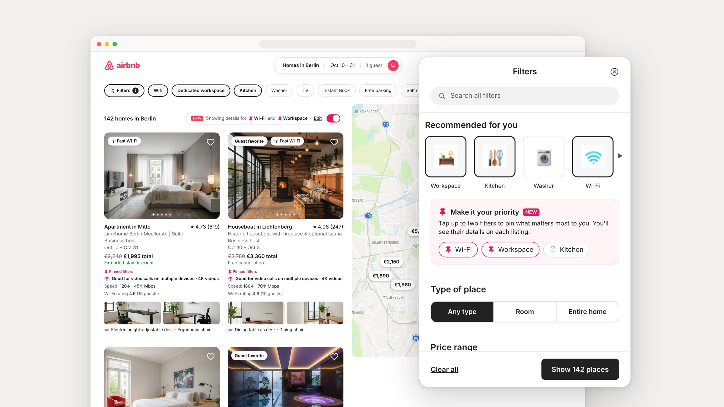
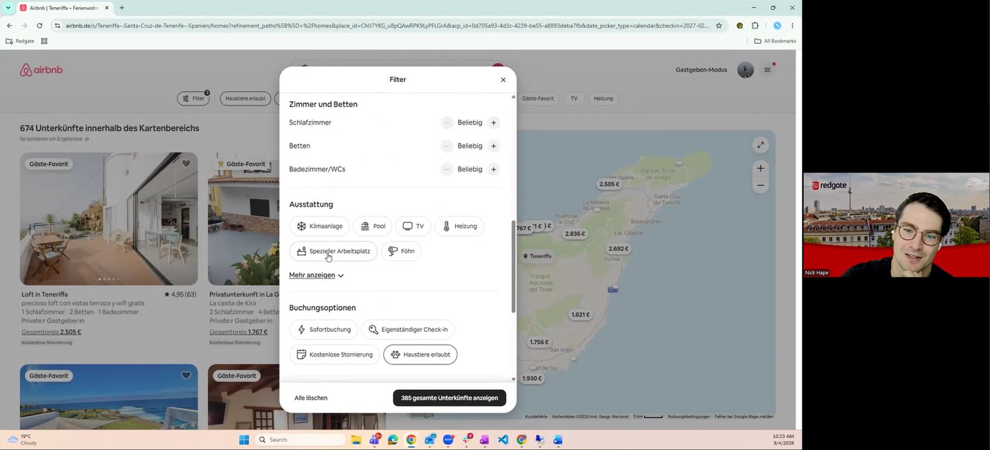
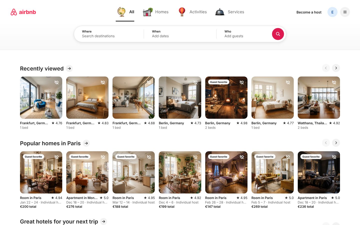
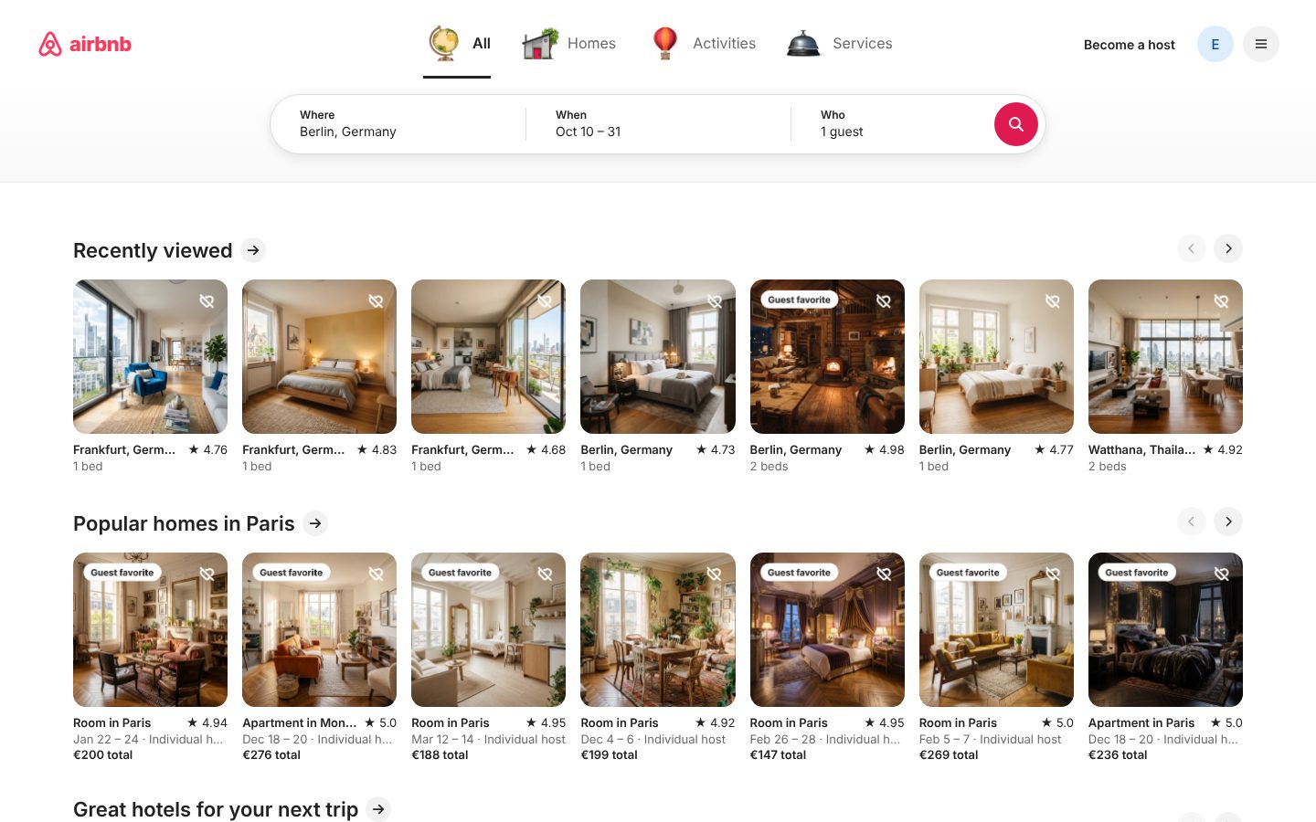
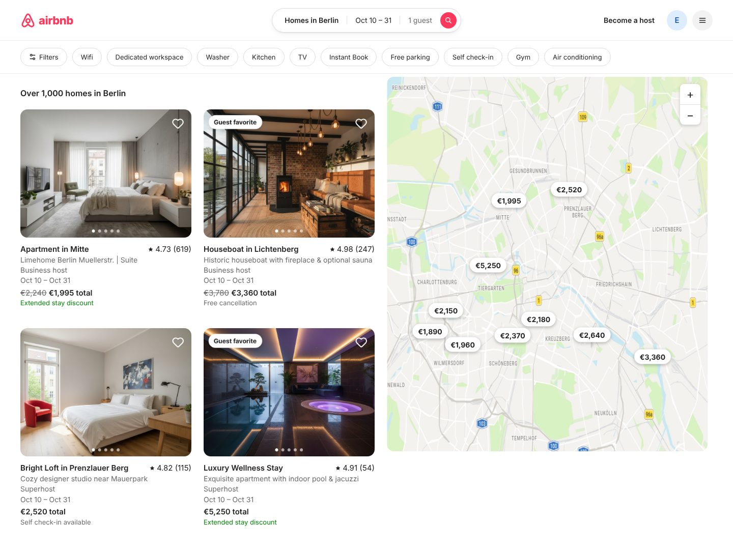
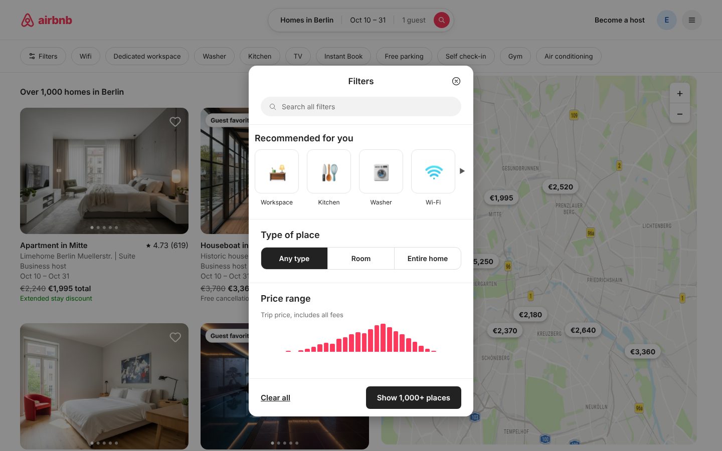
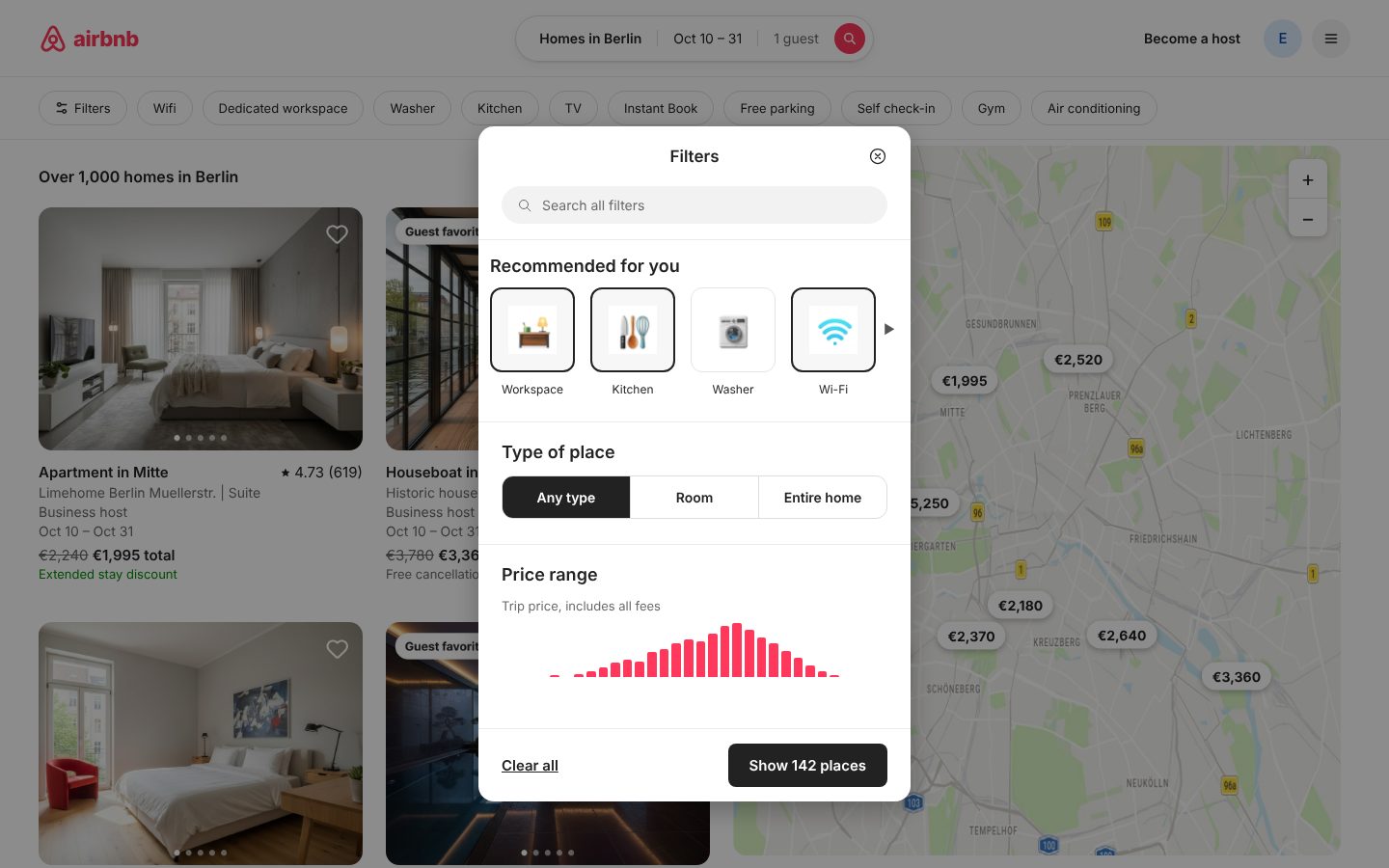
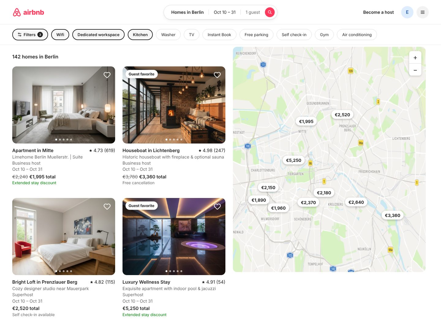
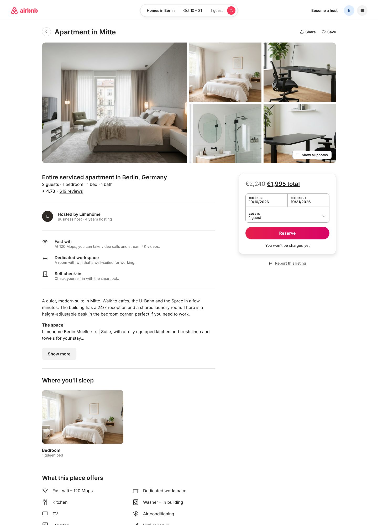
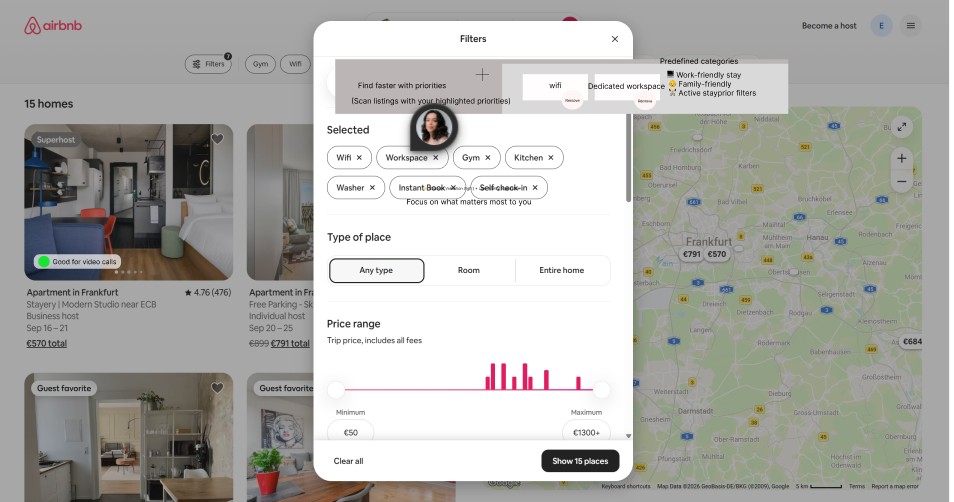
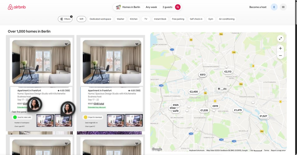
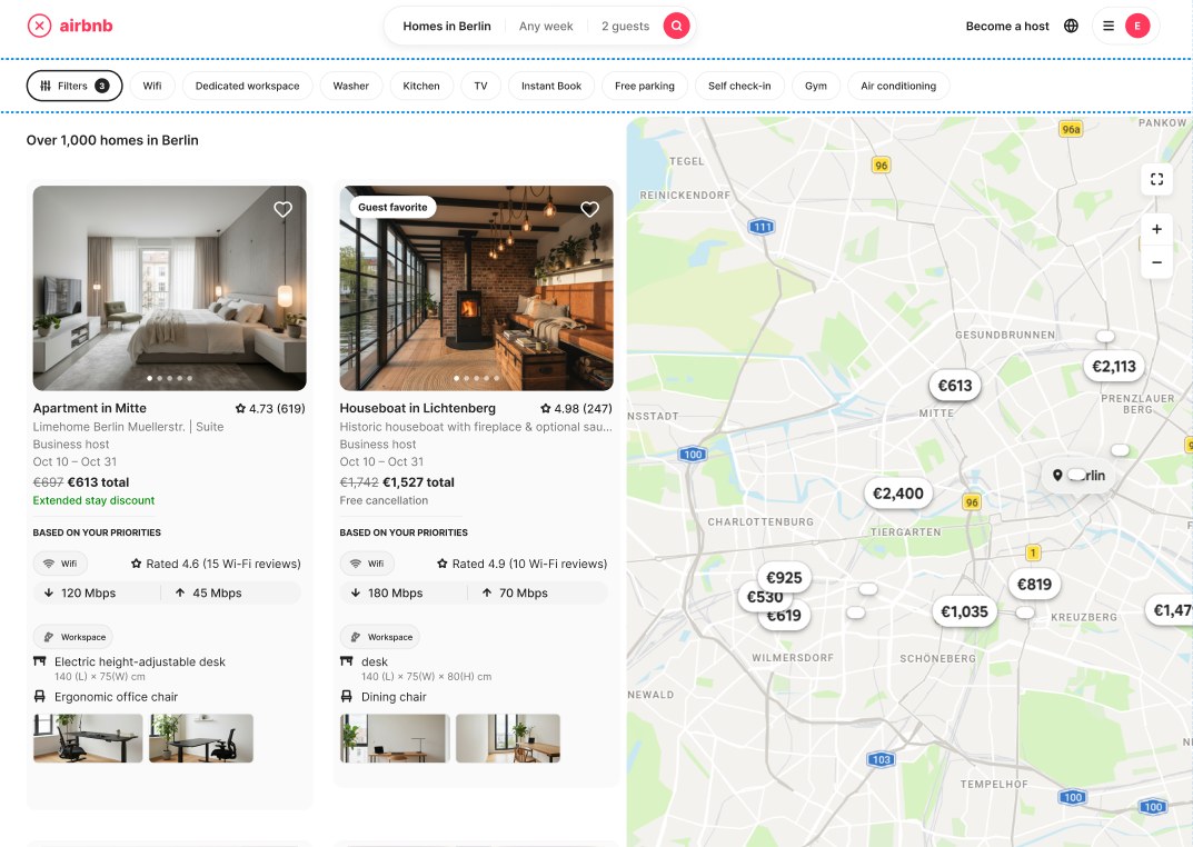
Based on my research and the test findings, I redesigned the feature with the help of Claude.
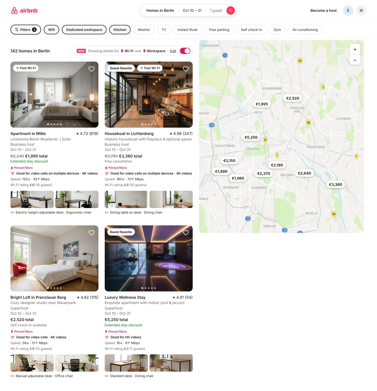
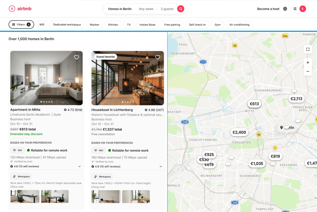
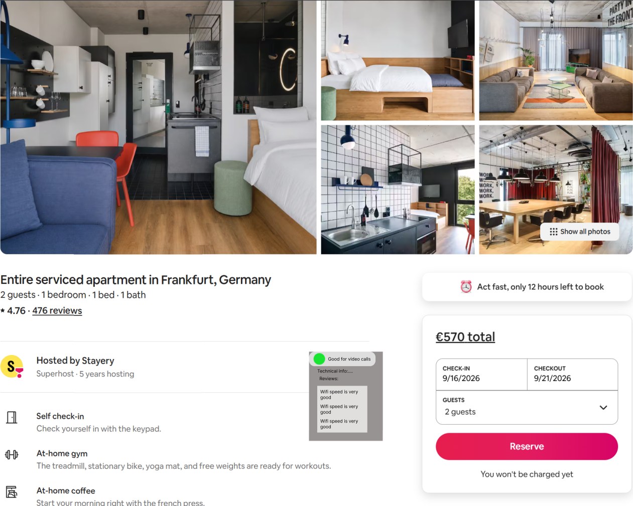
Test findingThe listing cards had too much information.
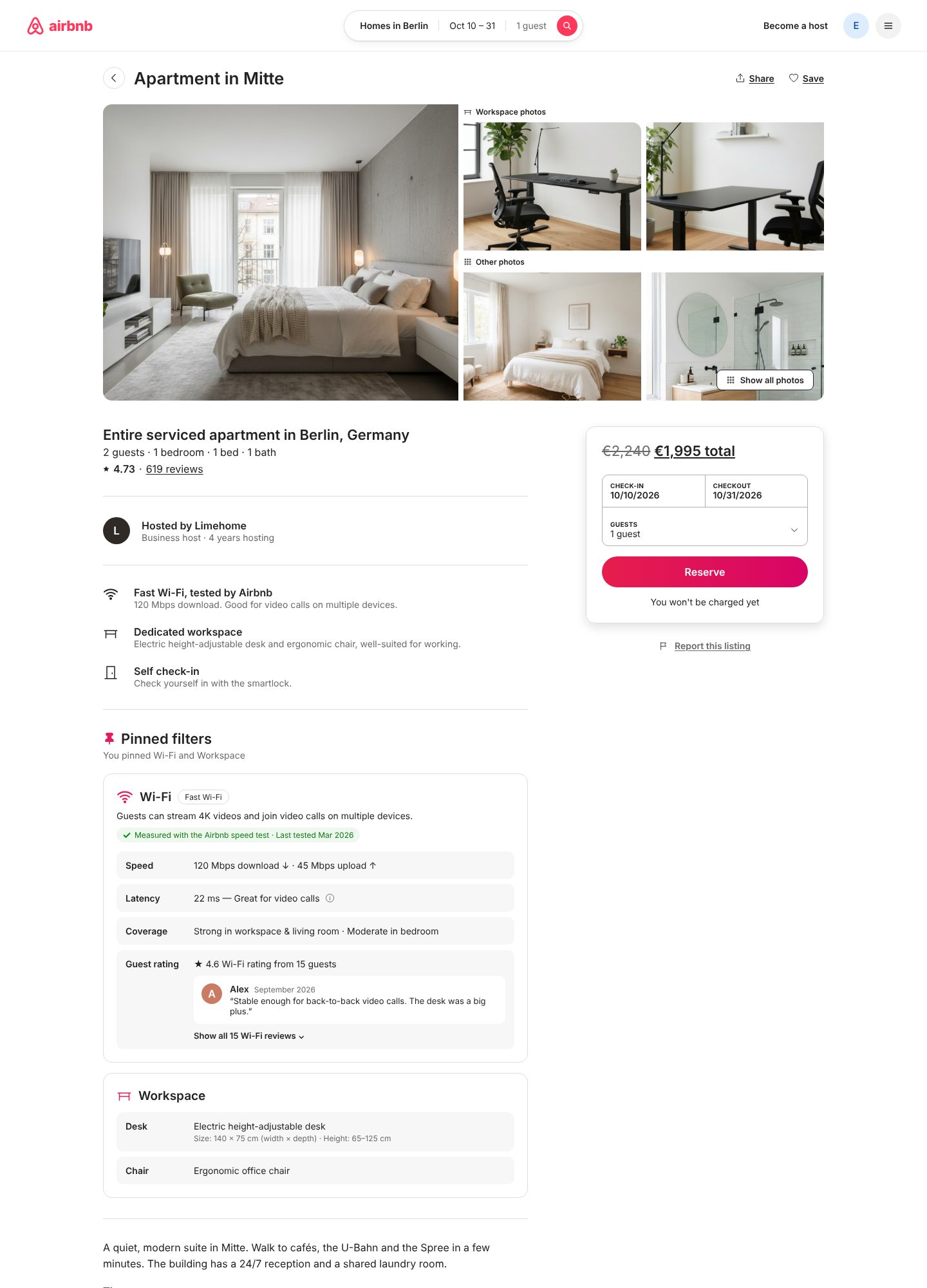
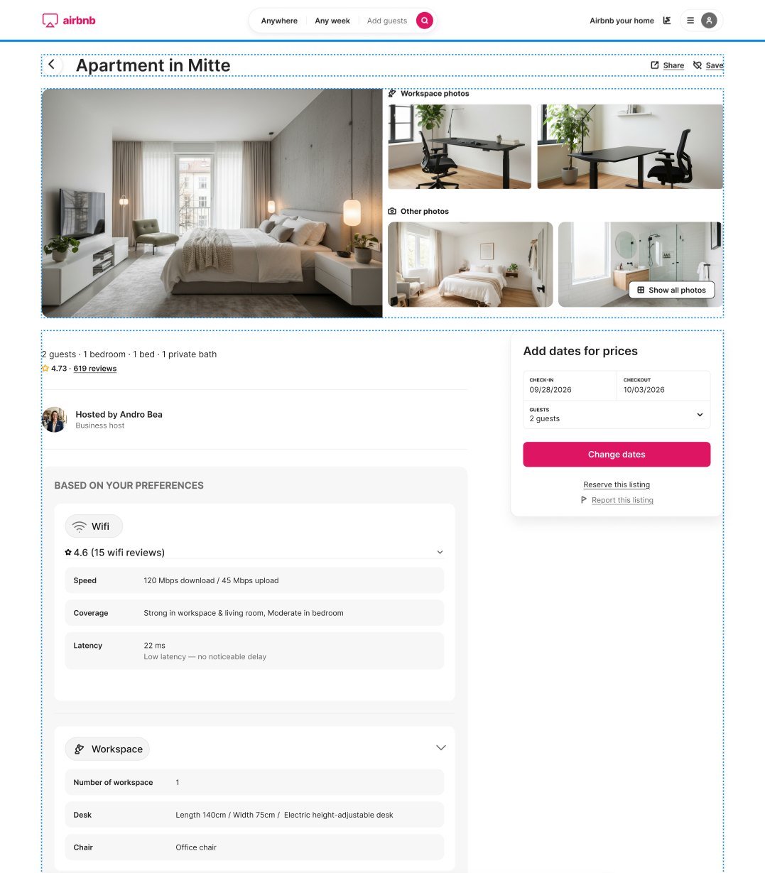
→ChangeA short “Pinned filters” block on each card: what the Wi-Fi is good for, its speed and rating, and the workspace photos.
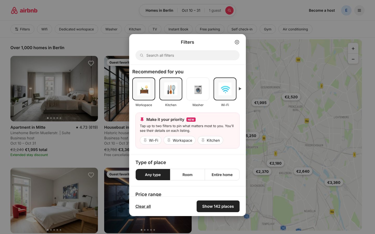
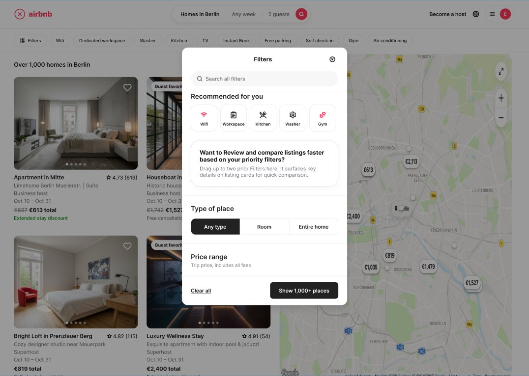
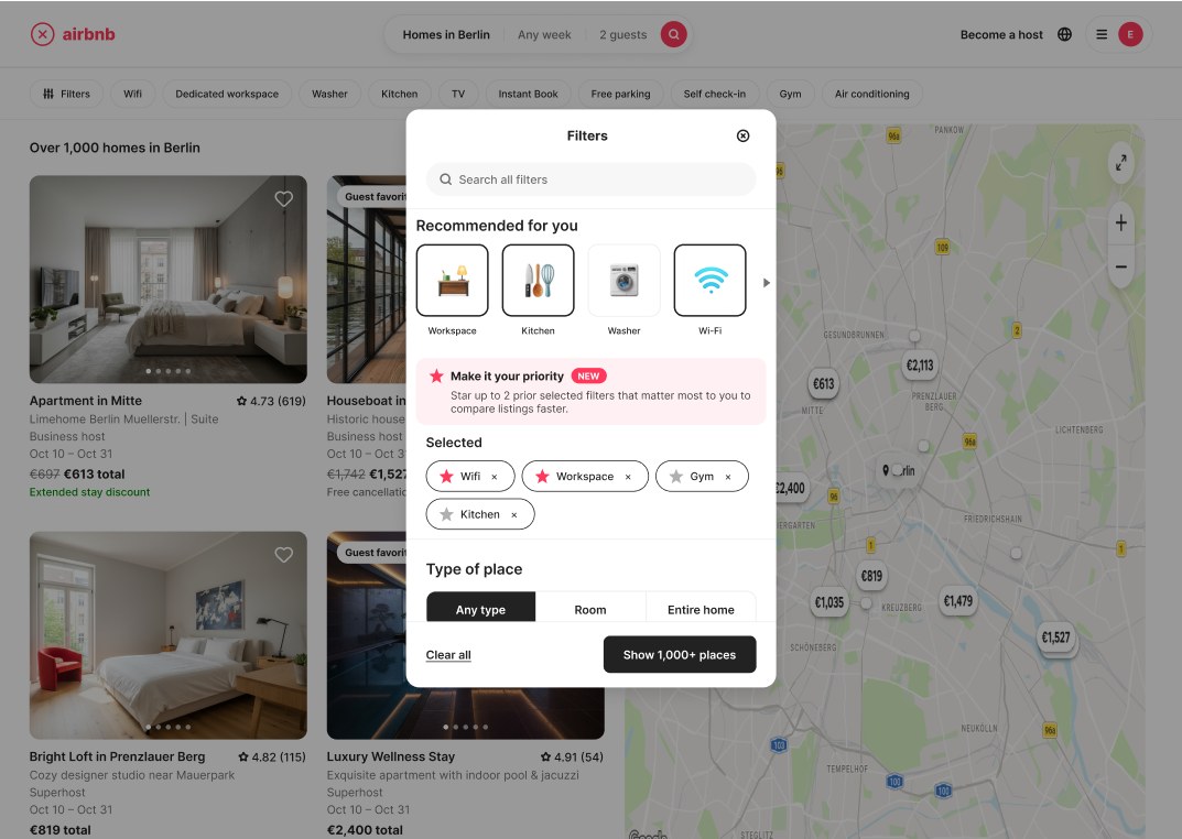
Test findingThe priority option was easy to miss in the Filters window.
→ChangeA clear pink “Make it your priority” box, where users tap to pin up to two filters.
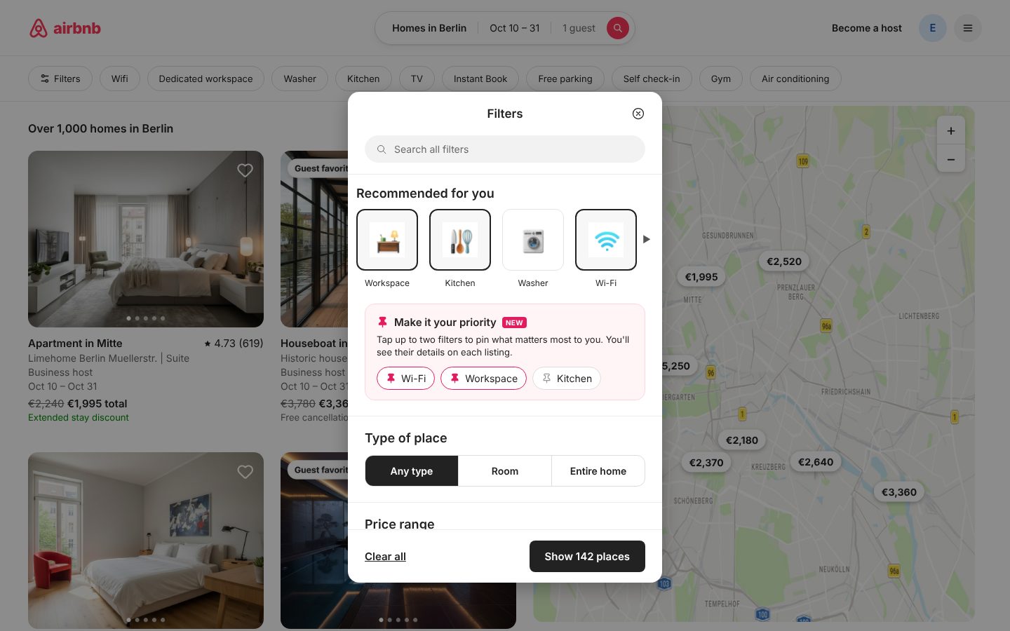
Design reviewThe star I used to mark priorities clashed with Airbnb’s rating stars.
→ChangeReplaced the star with a pin, which means “keep this in front of me” and has no other meaning on Airbnb.
Claude's first versions didn't always meet basic UI principles. In some places the spacing broke proximity, so related items didn't read as a group, and some parts didn't feel neat and clean. Other parts didn't match Airbnb's visual language. I reviewed each screen, asked Claude for specific changes, and kept refining until I reached the final result.
How the Wi-Fi labels work
For the Wi-Fi details, I used Airbnb's own Wi-Fi speed categories, which are based on download speed. Airbnb describes each category with a sentence about what the connection is good for. On the listing cards, I used a short version of these sentences instead of category names like “Snappy”, because people understand “good for video calls” more easily.
- Download speedAirbnb categoryLabel on the card
- 50+ MbpsFastGood for video calls on multiple devices · 4K videos
- 25–49 MbpsSnappyGood for video calls · 4K videos
- 7–24 MbpsSolidGood for HD videos
- 1–6 MbpsBasicGood for messages & web browsing
As in Airbnb's categories, only listings with 50+ Mbps are called “Fast wifi”. The upload speed is shown next to the label, because it matters for video calls too.